

The approach briefly described in this post, relies on MongoDB Shell (exploring functionality) and two cloud services: MongoDB Atlas (hosting the data) and MongoDB Chart (visualizing the data). The post won't say much about the pros and cons of MongoDB, which is used by companies like Uber Technologies, Lyft, and Codecademy. A noSQL database is a suitable candidate when data don't have a pre-defined data model. In the case of Spotify, that aspect doesn't really matter, since the structure is pretty defined and standardized, e.g. a simple record (or 'document') would look like this:
_id:5eab60ad8e4dedbd6894f670
endTime:"2019-04-25 09:19"
artistName:"Lady Gaga"
trackName:"Shallow"
msPlayed:215733
Still, MongoDB Charts turned out to be fairly helpful for visualizing the data set intuitively. A suitable mapping of SQL to noSQL terms can be found here https://docs.mongodb.com/manual/reference/sql-comparison/
Installation
MongoDB Compass can only be installed by downloading the respective tarball from the download centre as described in the installation notes
https://docs.mongodb.com/manual/tutorial/install-mongodb-on-os-x-tarball/
While it’s always a good idea to experiment with shell commands, a GUI such as MongoDB Compass can also provide an overview of the different components within MongoDB as well as the specifics of your personal databases.
Getting started
The balance between following a tutorial or simply learning by trial and error depends largely on why someone is learning a new tools. And of course, everyone has different possibilities for spending time on learning the fundamentals behind non-relational databases such as MongoDB. Anyway, this post is clearly geared towards getting a quick visualization of an existing dataset, namely some ‘Spotify’ listening habits.
My recommendation is a ‘MongoDB crash course’ of about half an hour by Brad Traversy (including a cheat sheet in the notes section of the video) https://www.youtube.com/watch?v=-56x56UppqQ. And if this catches your interest, you can continue to the MongoDB university https://university.mongodb.com/
I had four steps to follow:
- Download from https://www.mongodb.com/download-center/compass
- Copy unpacked folder to /somefolder/
- Add the following line to .bash_profile, replacing ...
export PATH="/somefolder/bin:$PATH" - Create a folder
/data/db(that would be different fort the latest Mac OS Catalina, e.g./usr/local/var/mongodb). However, the folder does specify the default data path for MongoDB’s WiredTiger storage engine.
If for some reason a conflict of ports occurs, the ports for MongoDB server and shell can be change with a command line option as in mongod --port 27018 and mongo --port 27018.
Subscribing to MongoDB Atlas
Atlas is a cloud database service (or SaaS), it’s useful for large datasets and free for learning and prototyping, i.e. as long as you don’t need a dedicated cluster, it’s free. The docs guide you through the six basic steps and you are set:
https://docs.atlas.mongodb.com/getting-started/#table-of-contents
Part 1: Create an Atlas Account.
Part 2: Deploy a Free Tier Cluster.
Part 3: Whitelist Your Connection IP Address
(there is a handy option ‘use current IP address)
Part 4: Create a Database User for Your Cluster.
Part 5: Connect to Your Cluster.
Part 6: Insert and View Data in Your Cluster
(for that we can use mongoimport)
Importing JSON Data
MongoDB comes with a number of utilities such as mongoimport and mongoexport. The former will help to either import our Spotify dataset locally or to the Atlas cloud service.
From the command line we need to run the following command with a number of options for JSON data:
mongoimport --host xxxxxx:27017 --ssl --username xxxxxx --password xxxxxx --authenticationDatabase admin --db spotify --collection music --type json --file ~/data/mongo/StreamingHistory0.json --jsonArray
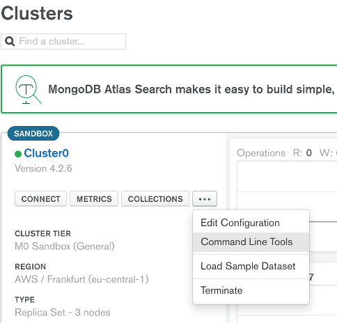
We can get an almost completely pre-filled template from ATLAS, though the command line option is somewhat hidden:
Once the data are ‘in the cloud’, we can select ‘collections’ and then ‘visualize your data’ (which brings us directly to charts.mongodb.com).
Visualizing the data
First we need to add our newly uploaded data to the available data sources. To do so, you connect to your existing Atlas cluster and select the data set there, you can then choose to ‘publish’ the data set, though only you have access as a default (however, data whose licensing prohibits the use of third party software shouldn’t be uploaded). The next step is opening a new dashboard, and from there on the first steps are pretty intuitive.
Example visualizations
Admittedly, the Spotify data were pretty grateful for a first trial with MongoDB Charts. Most field names were self-explanatory and suggested a number of ways for aggregation. For example, it was interesting to see that audio stories or podcasts played a fairly significant role.
For example, how often a song or group was listened to throughout the year seemed a fairly natural starting point
Time in general was an interesting grouping factor in matrix-like visualizations, such as, what music / podcast was listened to most, at what time of the day.
Lastly, I applied two filters, one visualisations focused on concerts / podcasts longer than 30 mins and another filter picked TKKG podcasts for an entire year.
The accumulated times show two recognizable peaks, one around 10:00 AM and a second one 03 – 05 PM.