

When there isn’t enough time for developing your own data visualization, dashboard that allow sharing are a great option. I’ve already described my experience with MongoDB Charts.
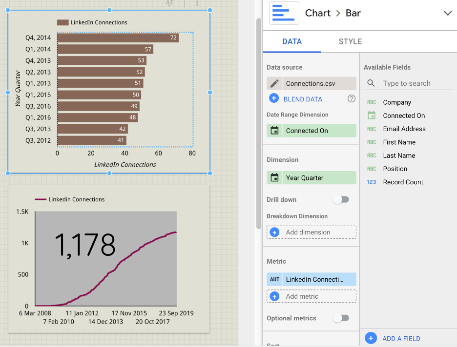
Google’s Data Studio (https://datastudio.google.com/overview) has a similar approach in that you basically chose the type of visualization - https://datastudio.google.com/visualization - (treemaps, bubble charts or maps are some of the not so excel-like-options), connect your data sources and specify dimensions and metrics.
Roughly speaking, you can explore:
- Your own data sets (e.g. I try a csv file describing my linkedin network),
- Data from a public API (like Covid-19 cases or the usual stock price charts),
- Data from Google Products you might use, which comes in handy since I can integrate ‘Search Console’ and ‘Google Analytics’.
The link for the analytics example is this link, but a more detailed comment follows.
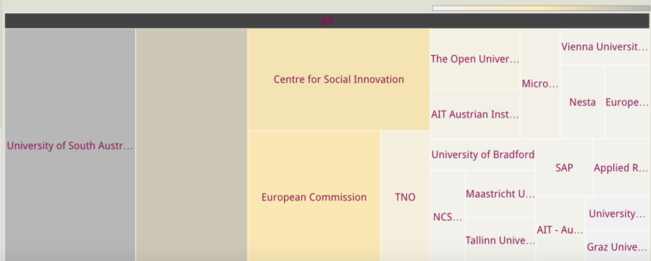
You also find community visualizations like this interactive ‘sunburst diagram with JS code on Github included.
I wouldn’t go down that rabbit hole now, since the original ideas was track data and visualize them with the least amount of effort possible. However, in the long run it might be useful to explore the 500+ datasets or data sources published on Data Studio’s home page (https://datastudio.google.com/data). Connecting with data.world (https://data.world/chrvoigt) could be an interesting option for the future.
Overall, the visualization is pretty good. The following figure shows it well: (1) on the left side I define the number of connections (metrics) on a timeline (date) and aggregate the data for each quarter of the year (dimension = Year Quarter). So I can see that I’ve connect most during 2013 and 2014, which is also reflected by the slightly S-shaped curve below.
Another possible analysis was to look at the organisations where I have more connections, though this can be pretty unreliable since the ‘company field’ is not standardized and slight changes (capital letters or not, different languages, adding a department, use of hyphens or abbreviations etc) would lead to a new entry to the frequency count.
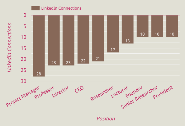
Finally, no surprise when sorting positions as they reflect my core area of activities, applied research projects. Off the top of my head I couldn’t mention the 10 founders, so I will probably inquire who they actually are ...
However, dashboards have their drawbacks if you find out that at the bottom of a table you need a 'median' but all on offer is a lump sum. Or if you feel like you would love to have more control over the appearance, then you might be at a point where you use the dashboard just as your data supply and include html / javascript for more adaptable visualizations.