
Objectives & Context
This blogpost documents how to encode data on a map. Information about a journey (list of places) are collected via a DIY self-tracking gadget based on ESP8266 and Ublox 6m GPS receiver (an activity to be described in another blogpost). Code and data set are available at https://github.com/chrvoigt/kepler as well as a demo map at https://chrvoigt.github.io/kepler/ . Alternatively you can experiment with the notebook on myBinder.org . Keeping in mind the specifics of using Binder (e.g. max 2 GB of RAM, 12 hrs max session time, if you close the browser window, the session is deleted within 10 min).
![]()
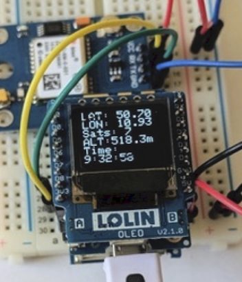
The data generated by the gadget (see image above) include the following fields
    * Date: 130220
    * Time: 16:47:18
    * LAT: 48.184197
    * LON: 16.330658
    * ALTitude: 283.20
    * number of SATS: 7
    * Speed of Sats: 0.1667
    * Precision: 1.30
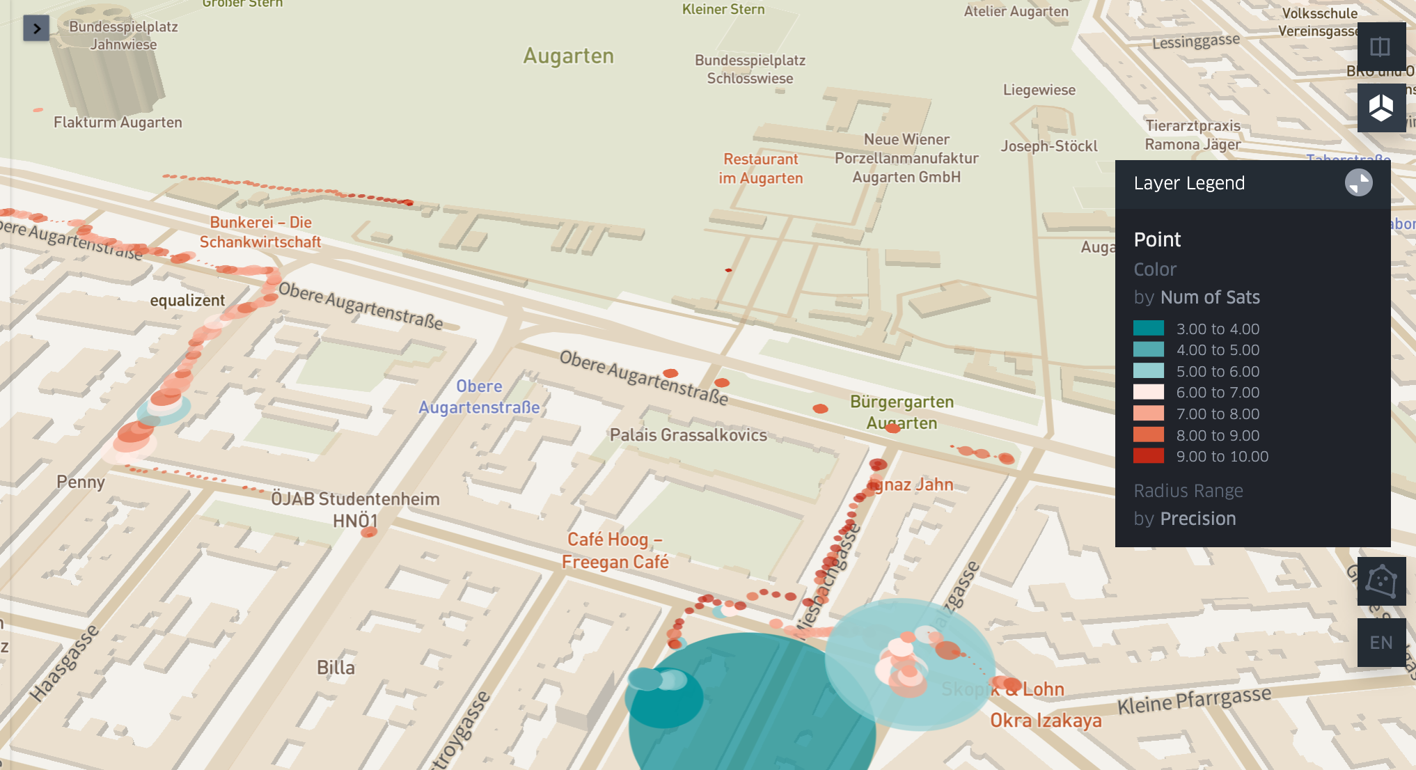
First we looked at location data as well as the number of satellites and the associated precision of the location. Precision is expressed via DOP values, an indicator of the dilution of precision , where 1-2 is excellent, 3-5 is good and 5-20 is moderate or fair. In general, we can say that precision increases with the number of satellites, however many factors can influence the DOP such as the geometry of the satellites (e.g. the closer they are together, the less precise is the position they can provide).
Depending on why we collect location data, precision becomes more or less important. For example, a map with landmarks needs to guide the user just close enough to the location, so precision is less of an issue. If we plan to use GPS signals for pinpointing the perimeter of a garden or an obstacle, GPS precision should be fairly high. The gadget will provide a number of additional data to be defined according to the use scenario, however, data quality in terms of the changing precision of measurements might be interesting in general when collection GPS data. Kepler.gl (https://github.com/keplergl/kepler.gl) is going to help us to render a path including information about data quality. It is also a user friendly tool as described in the next section.
Some brief comments on Kepler.gl
Kepler.gl renders large datasets on maps and "GL" stands for OpenGL, the industry-standard Open Graphics Library. The tool was open-sourced by Uber in 2018 and is part of the urban computing foundation. UCF had been started by the Linux Foundation, also promoting projects such as viz.gl and Mapzen. Kepler is built upon Mapbox , which is a service providing sets of tiles displaying maps in different styles (e.g. streets, terrain, traffic ...).
You can also build your own map style (e.g. pink houses with black gardens), though then you need to register on mapbox.com. There is no credit card required for registering, and on the free plan you get 50.000 free map loads per month (as of August 2020). For small applications the free plan should suffice.
On an interesting side note, you can compare Google Maps and Mapbox according to different types of geospatial applications here: https://yalantis.com/blog/mapbox-maps-ready-mobile-apps/ Examples include street-based retailing, travel planning, navigation, logistics, gaming etc.
For the following example we will only use point data, taken from a csv file, however, kepler.gl supports data formats such as CSV, GeoJSON, Pandas DataFrame or GeoPandas GeoDataFrame.
Generating the Visualisation, prepping the data
For our purpose, we will use the CSV (generated by the microcontroller) and load it into a data frame.
import pandas as pd
import numpy as np
df=pd.read_csv('data.csv', sep=';')
df.head()
At this stage - for the sake of keeping it simple - we need to ensure three things: (1) Kepler needs to find two columns having the labels 'Latitude' and 'Longitude' and (2) the string in these columns can have only 1 point, unlike the GPS coordinates generated by the GPS unit, which include 2 points. (3) Data types in the dataframe should be numeric where needed.
Note: disabling chained assignments avoids the warning 'a value is trying to be set on a copy of a slice from a dataframe')
pd.options.mode.chained_assignment = None
for i in range(len(df.Longitude)):
    df.Longitude.loc[i] = df.Longitude.loc[i][0:6] + df.Longitude.loc[i][7:10]
    df.Latitude.loc[i] = df.Latitude.loc[i][0:6] + df.Latitude.loc[i][7:10]
df = df.apply(pd.to_numeric, errors='ignore')
df.to_csv('data_formated.csv', encoding='utf-8')
The fixed data frame is then stored to 'data_formated.csv'. I then generate a dataframe with just 3 columns (time, number of satellites, precision of GPS). I also convert the date-time strings to timestamp objects, which allows for calculating a time delta.
sats = df.iloc[:,[1,6,8]]
sats.loc[:,['Time']] = pd.to_datetime(sats.Time)
print (round((((sats.Time[len(sats)-1] - sats.Time[0]).total_seconds())/60), 2),'Minutes')
For testing I have collected data over a period of 97.32 Minutes. Switching the tracking on and off, this made up for 1,334 location data. The following snippet puts the timeseries of 'number of satellites' and 'GPS Precision' into a graph
sats = sats.set_index(['Time']) # enables Time on x-Axis
ax = sats.plot(
    figsize=(15,5),
    subplots=False,
    alpha=0.7)
ax.set_yticks(np.arange(0, 21, 2))
ax.set_yticks(np.arange(0, 21, 2))
ax.grid(np.arange(0, 21, 2), alpha=0.4)
ax.set_ylabel('Number of Satellites / Precision ')

figure = ax.get_figure()
figure.savefig('time_series.png', dpi=400) 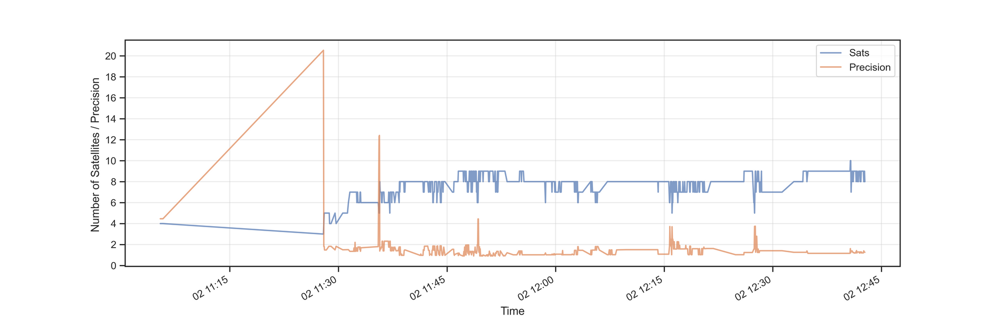
After 11:30 the number of satellites increases and a precission value below 2 indicates high accuracy. In two spots we can see a mirroring of changes, i.e. number of staelites drops to 5 and the imprecision of the location increases to 4.
Eventually, we can read in our formated CSV file and render it on the map. After we have imported kepler.gl and created the kepler object
import keplergl
map_csv=keplergl.KeplerGl(height=600)

with open('data_formated.csv', 'r') as f:
    csvData = f.read()
map_csv.add_data(data=csvData, name='vienna_df')
# map_csv.config = config
map_csv
After the last step, your map might not look like the map we have seen at the beginning of the blogpost. Rather, it might be a single color / single size track. However, through the GUI of the widget you can associate 'color' with 'the number of satellites' and the size of the bubble could correspond to the 'precision' value etc. Once the map appears as it should, the configuration values can be saved and reused for any other map in the future ...
with open('map_config.py', 'w') as f:
   f.write('config = {}'.format(map_csv.config))
# load the config with following magic command
# %run map_config.py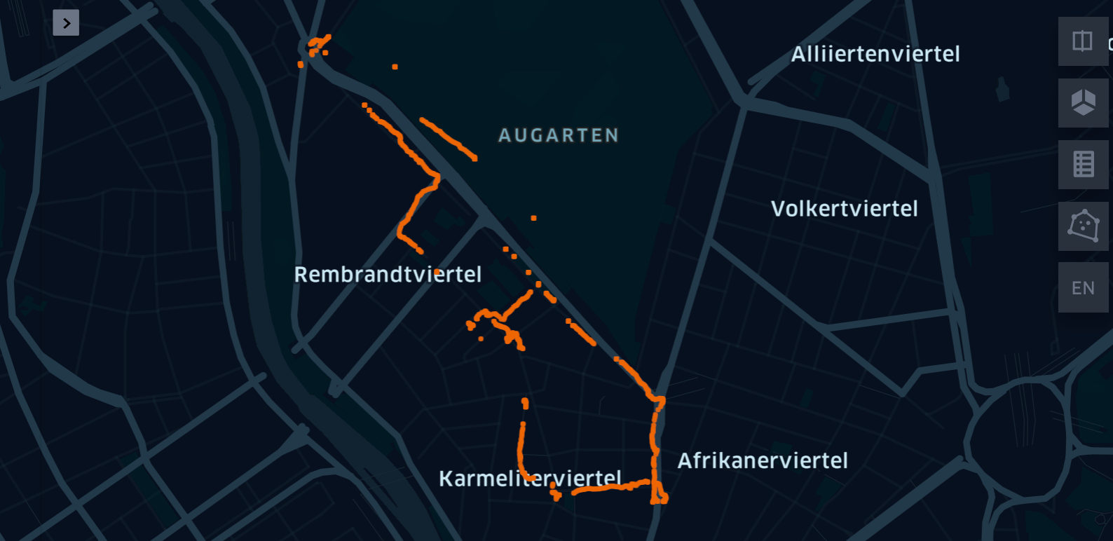
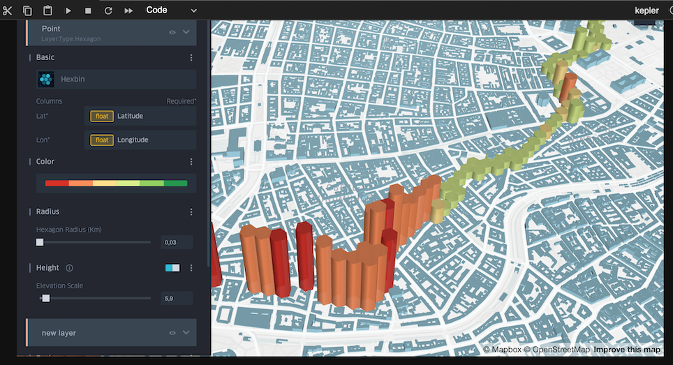
There are about 8 different visualization types and it's worthwhile to try them out in order to get a feeling for their expressive powers. Following, for example, you can see similar data, i.e. number of Satellites ranging from red (4) to green (10) and also the precision of location data (the higher the more imprecise).
You might wonder about the nature of the 'journey'. It's bascally a trial for future science worksops (part of the Systems2020 project), where participants collect data 'in the wild' related to the theme of the workshop. In the above case we thought of mapping recycling stations (glas, paper etc) ... see the Google Maps version.