
'A map is not the territory it describes' is a statemment from Alfred Korzybski, referring to the idea that representations transport more than mere abstractions of facts, e.g.how we think about our environment and what we include or leave out.
IPyLeaflet is a quite remarkable Python library, supporting mapping functions with only a few lines of code. How often do we feel restricted by the limitations of a tool, that doesn’t let us emphasize the piece of information we find particular interesting or highlight relationships we see emerging from the mapping action.
Note: This post is also related to a previous foray into mapping using Kepler. Then the focus was on the reliability and accuracy of the GPS signal, which proved to be quite high once a good satellite fix was achieved. Today it’s more about
So what can we do with IPyLeaflet-powered maps?
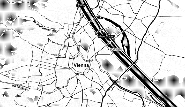
The main idea is to use interactive maps – using the fantastic ipyleaflet library in Python. For starters, we get a great set of base maps and styles, see the example below. So one decision to make would be
What information should my underlying map convey?
If it’s street names, streets and pathways, I might go with the black and white variation. If it’s the portion of green and paved spaces, I might prefer the coloured version. There is also an interesting bluish / grey map, which helps if the markers we want to put on the map aim to communicate through colours as well, in which case the map shouldn’t absorb too much attention.
There are excellent documentation and various examples all over the Internet. However, to keep it practical, the second part of this posting provides an annotated example of a script using the same data from a real, albeit brief, data collection exercise, which help to illustrate the following steps.
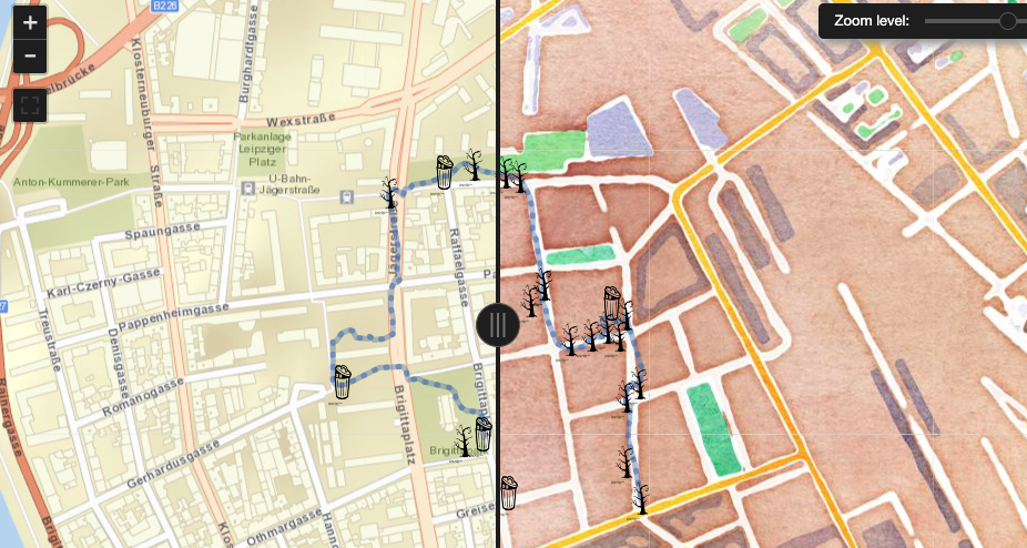
We use a simple DIY device (clearly another writing opportunity for the future) supporting our data collection. I believe, similar data could be obtained through manipulating custom maps in Google’s Map service. Essentially our outdoor mapping provides two types of information: first, where did we go, during our mapping activity? I mean, clearly it makes a difference in what neighbourhoods we look for the stuff we are interested in. We might find more Graffiti in backyards or side allays than in a main street, hence just showing a section of a map including markers is not enough as it doesn’t tell us about the blind spots we had when scanning the area.
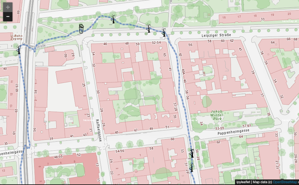
The following example looks at a hypothetical relationship between rubbish bins and increased pollution of trees nearby. The more precise the mapping activity can be described, the more focused and rewarding it will be (imho). For example, ‘trees nearby’ was operationalized as those quite distinguishable areas (2x2 meters) as shown in ‘Leipziger Straße’ ... i.e. the nicely lined up green blobs.
Overall, our small experiment is based on
- a walk of 25 min walk
- covering about 1.7 kilometres and
- mapping 22 points of interest.
The 22 points included 5 overflowing rubbish bins and 17 polluted tree spots. Their distribution is shown on the map below, including the walking path in blue. Even with this small example we can see that polluted trees and overflowing bins don’t necessarily correlate. So, a follow up reflection including some research could be to know more about urban waste management, i.e. how often are bins emptied and how often are streets swiped; what cost is involved in that and how much rubbish do they actually pick up.
What kind of information do we need to be embedded in our map?
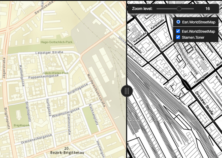
What really helped was diving deeper into the available mapping material for Vienna and Austria, e.g. to get the tree information on the map. As a next step, we can think again about the background map and had a good impression of the water colour style on the right – it actually leaves a lot of freedom to put our own information on the map.
What we haven’t talked about yet, is the flexibility we get in choosing an icon to mark a spot on the map. You could certainly attempt to do that yourself, there are easy ways to put a drawing into a GIF or a PNG. We opter for the nounproject which provides good materials under an open CC by Licence:
Trash Bins: https://thenounproject.com/term/trash-can/24231/
Sad Trees: https://thenounproject.com/search/?q=trees&i=441094