If you want to check out the visualizations described or are interested in following along with the data used, here are a few resources:
- The underlying research project – DOIT
- A concrete example of a workshop as part of the overall study
- For a comparison with visualizations in Python
- Slides & Data set
A short intro video to Tableau
The underlying research in a nutshell
Tableau can be used in a variety of ways and include different degrees of interactivity, i.e. users can, for example, select features or countries or specific groups of a population (old vs young, male vs female etc).
In this blogpost we use the data from a simple pre- post research design. We measurred a number of things, but for the present blog post we only need the scores of the creativity test, which was taken before and after a series of workshops covering at least 15 hrs and aiming to improve creativity.
Tableau, an example for a low-code approache
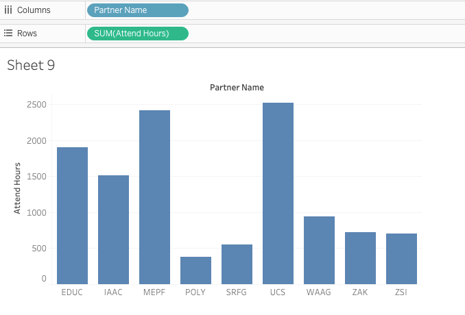
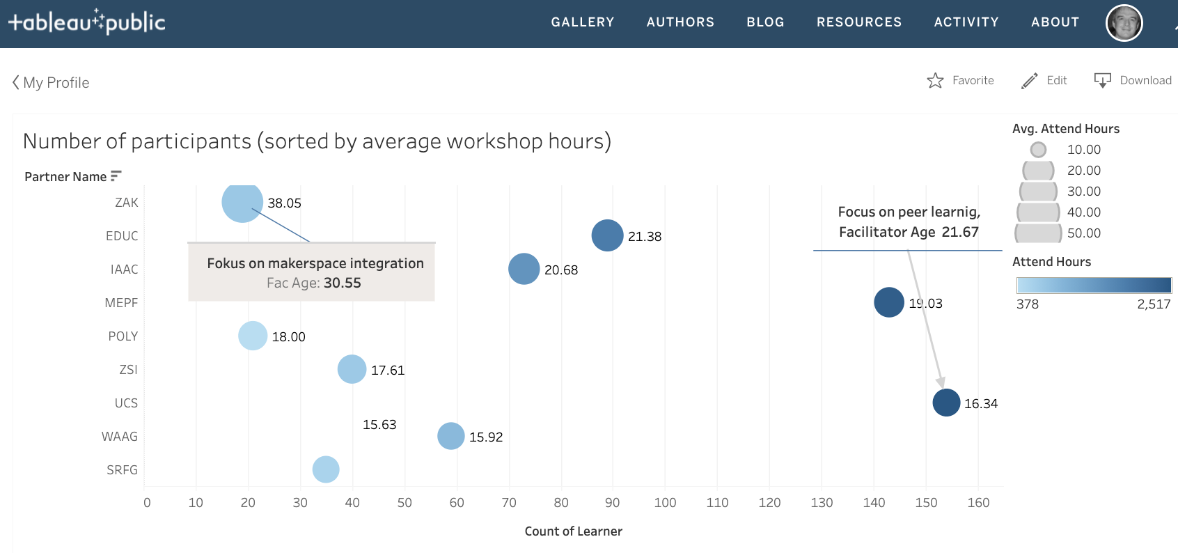
Tableau is well known for its intuitive features, allowing us to connect to Excel Files and easily arrange data in two-dimensional spaces. Basic interaction with Tableau, at least when getting started with the application, consist of drag, drop, checking / unchecking features and selecting visualization forms. Hence, the following figure is the result from literally dropping two variables into Tableau’s column and row pane.
Each column or bar represents a 'partner' in the research project, normally that would be a science centre, a fablab or a museum, organizing workshops for youths. Hence, below we se a diagramm displaying workshop duration multiplied with the number of participants. For now, that's an arbitrary suggestion from tableau.
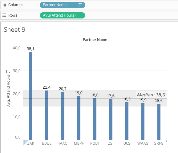
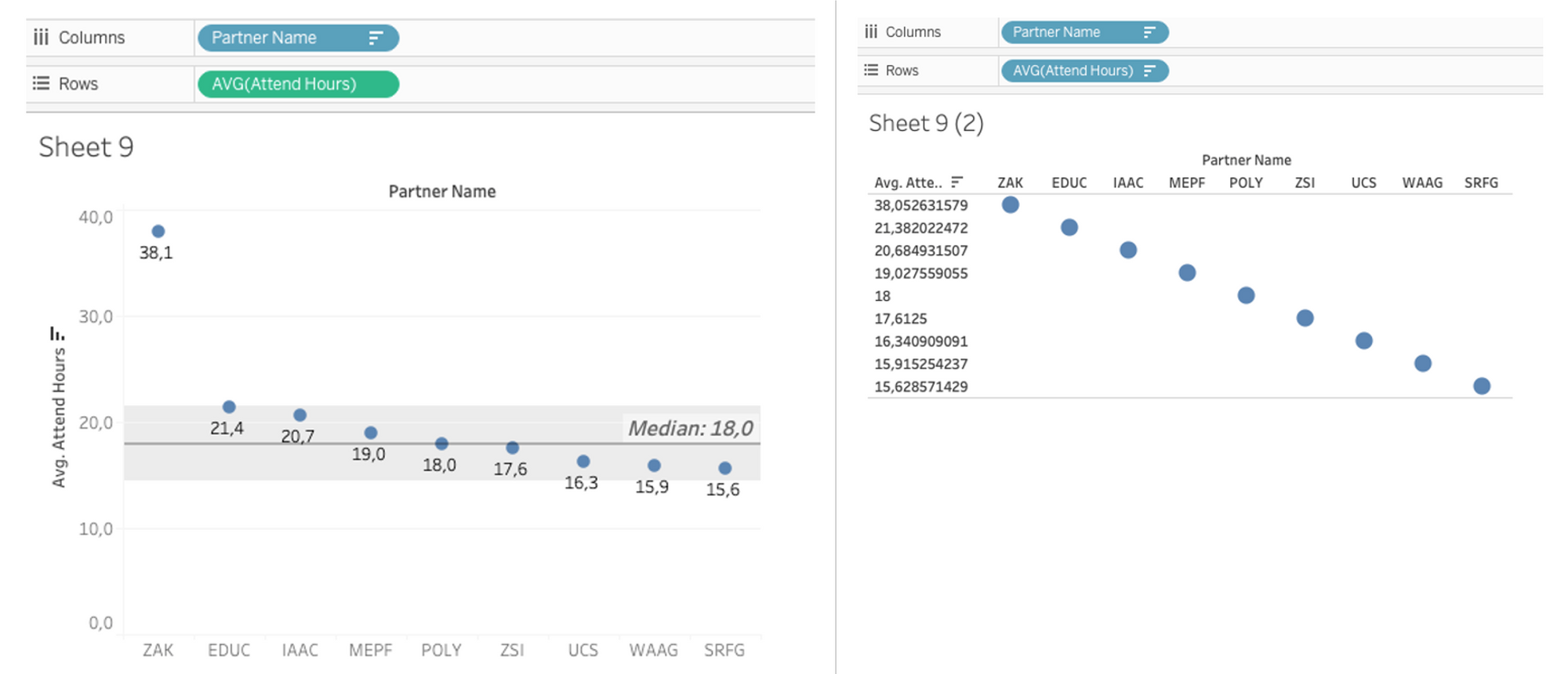
Of course, we should question Tableau’s first suggestion and it would take me two more clicks to get a visualization I can use. Actually, I would be interested in the participants point of view, i.e. the average number of attended hours per participant. Furthermore, I would display the data sorted by ‘hours’ rather than by the names of the organizations offering the workshops. And if I want to get fancy, I change the size of the bars, add a label (just a checkmark away), add a reference line to see the median across all organizations and add a meaningful label to the reference line. All in all that would take another four actions and I can see that all Organisations offer between 15 and 21 hours to their workshop participants.
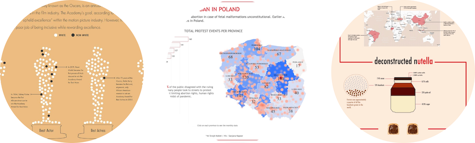
So far so good and it’s probably fair to say that you can get a similar figure in Excel as well. However, I would assume that given equally good knowledge of tools, you get there faster in Tableau. There are a few things you may only get with Tableau, if you check the public Gallery of Tableau, which features some impressive examples of creative visualizations.
Links for the above examples:
Last but not least, Tableau’s commercial version features a few connectors that make it easy to analyze large amounts of data, e.g. if your web site has google analytics included. Other accessible data cources include google drive, dropbox, PDFs, JSON APIs, Excel and all sorts of databases.
The more data you include and also depending on what objectives you would want to achieve when visualizing your data, a range of skills is required. And there is a longstanding discussion about what data visualization entails, what exactly is the difference between a data scientist, a statistician, or a machine learning specialist. And lately more attention is paid to data engineers too. Luckily, this isn’t the focus of this blog post and it’s sufficient to say that anything from illustrating a report, to providing an interactive dashboard for data exploration or telling a data story, where visualizations are composed to link data with a narrative, often focusing on how to make data less abstract, highlighting the implications on people’s lives. The following picture is taken from ’Gerald Benoit (2019). Introduction To Information Visualization: Transforming Data Into Meaningful Information‘.
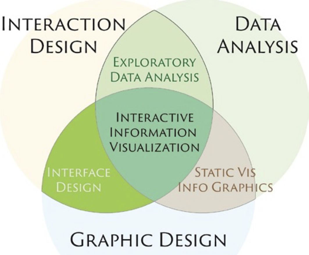
You certainly get away with not being an expert in all three areas (interaction design, data analysis, graphic design). But I also believe it shows if you have some foundational knowledge in these areas and then maybe show the final product around and see how people react, avoiding misunderstandings and making interacting with the data more intuitive. Again, ‘drag and drop’ is a real benefit if you want to check out various visualizations iteratively, because chances are that variations of a visualizations can be done on the spot, speeding up the development process.
Trouble shooting Tableau
Troubleshooting in the context of Tableau doesn’t necessarily mean that we get an error message. It would also be troubling if people would consistently misinterpret our visualizations of if we feel stuck because something that should work doesn’t ...
Hence the following 10 points are checkpoints in the sense that they propose an action along the lines of ‘Have you considered ...?’. And a perfectly fine answer would be ‘Yes, but I am happy to give this a pass.’
- What is it all about?
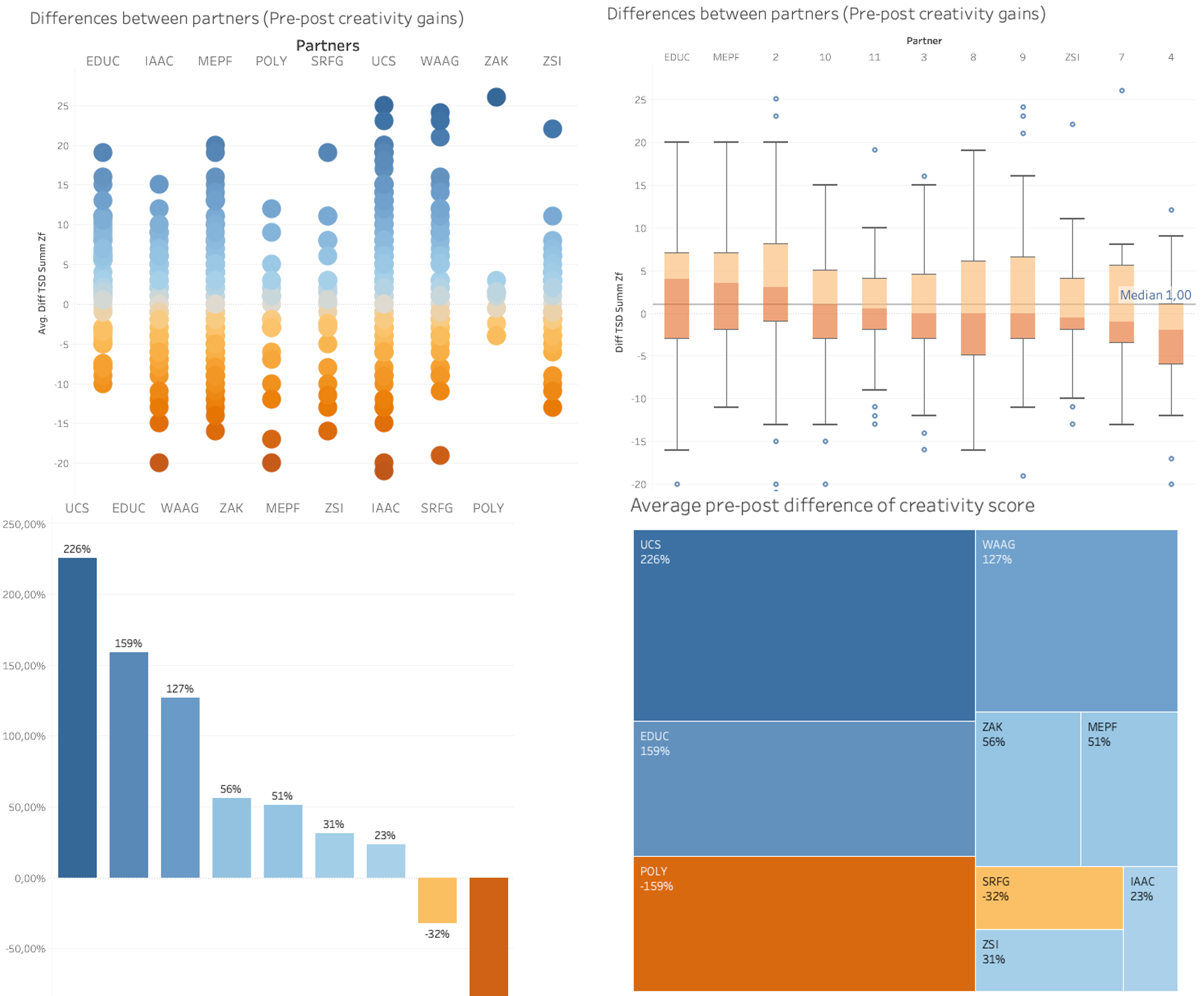
That’s the overall guiding question ‘What variables do I want to related to each other?’ This can concern the variables linked with x and y axes, or also include variables defining the size and colours of markers. An example of an earlier visualization related colour to the overall sum of participants per organisation and the size of a bubble represented the average length of a workshop. However a figure gets quickly overloaded if too many variable are added into the mix.
- Do I use ‘Dimensions’ or ‘Measurements’?
To make it short, ‘discrete measurements’ are ‘dimensions’. Usually dimensions contain qualitative information such as categories, dates or names.
’Measurements’ contain quantitative information, such as age, scores, participants or time and support different forms of aggregation, e.g. sum, count or average.
- If it’s a measurement, do I need aggregate measures or not?
As a default action, Tableau starts with ‘summing up’ a variable, which makes sense if we want to compare quantities per organisation (e.g. workshop hours delivered). However, in the context of our study we were primarily interested in averages, e.g. workshop hours attended on average by an individual or average improvements of test results (see below).
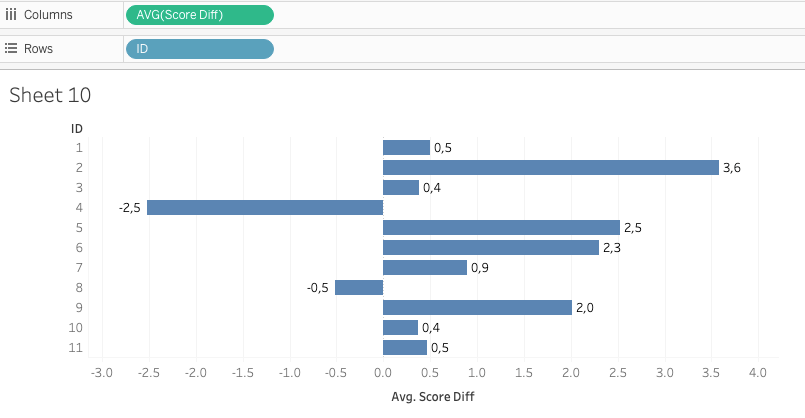
If I choose to disaggregate the ‘Score Difference’, I get a scatterplot for each organisation. Such a scatterplot is the perfect data to create a boxplot for each organisation:
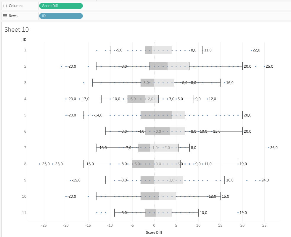
Hence, both visualizations are valid. It’s up to us to decide whether our message should focus on ‘averages’ – using aggregated measures – or on ‘distributions’ - using disaggregated measures-. The implications seem clear. Whereas in the former I am singling out the two organisations with negative averages (i.e. more people worsened after the workshop series), the boxplots show, how all organisations had their fair share of participants with lower test scores after the workshops.
- Continuous or discrete
That’s a seemingly simple check, but it is often overlooked. Dimensions or measurements can be either continuous or discrete. There are straight forward examples such as gender being discrete (e.g. 0 for no information given, 1 for female, 2 for male, 3 for non-binary etc.) and age being a continuous variable. Continuous implies that it makes perfect sense to be 13.6 years of age or to have an average age of facilitators of 32.4 years. Essentially when declaring a variable as ’continuous’ then I am also interested in the space between the measurement values. If, for example, I define two age groups (older and younger participants) then I am interested in reducing the level of detail, so it would describe a ’discrete status’) – a person is either in or out of a given age group.
However, nobody would stop us if we were to define the variable of average workshop hours not as ‘continuous’ (left) but as ‘discrete’ (right). As we can see, discrete values are simply enumerated and considered in isolation, i.e. distances between ‘averages’ disappear, which would drastically reduce the information contained in the figure.
- What supportive information do I want to add?
Tableau is very supportive in adding annotations, clusters, trendlines or underlying data (aka tooltips).
Simultaneously, we cannot only ‘add’ information but also ’modify’ details to increase clarity and focus of the visualization. This could be as simple as specifying number formats for axes and labels, using aliases, adapting sizes and colours or changing the type of diagram.
What’s Next
If we want to level up, there are a couple of things we need to look into:
- pivoting data,
- calculated fields,
- ‘level of detail’ expressions,
- table calculations,
- defining groups, sets and context,
- dealing with location data (longitude, latitude),
- and the use of ‘dual axes’.
Final remark
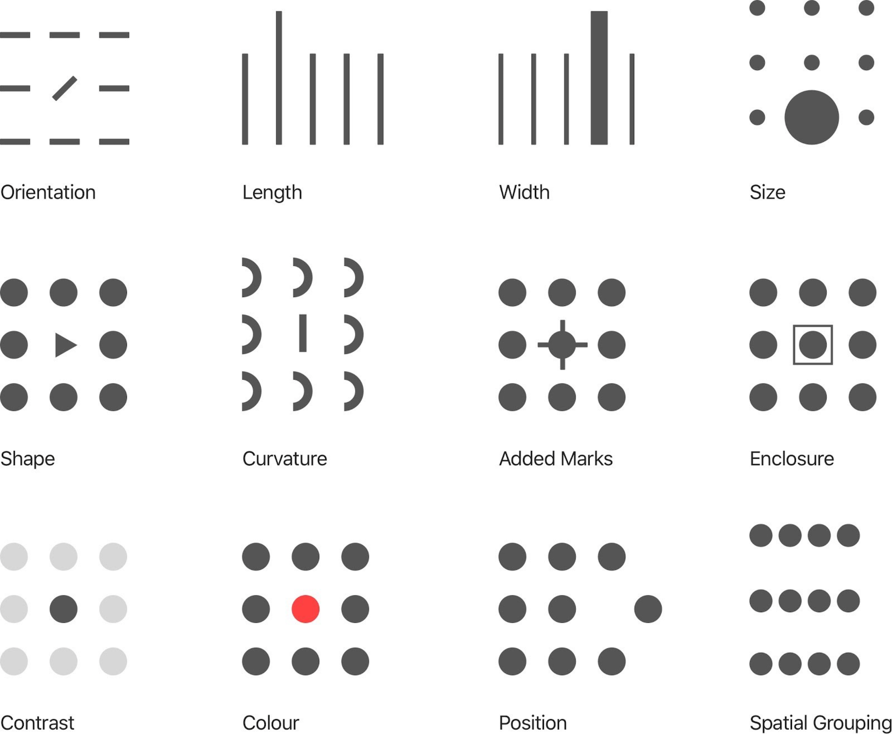
The design foundations of Tableau are based on the use of pre-attentive interpretation guides or better, as you can read on their website: "Visual analytics leverages pre-attentive attributes to guide you down the most useful paths. Pre-attentive attributes are information we can process visually almost immediately, before sending the information to the attention processing parts of our brain. The pre-attentive attributes are shown below."